Selecting website breakpoints is a critical decision that impacts the user experience. With the ever-expanding range of devices and screen resolutions available on the market, designers must prioritise responsiveness and adaptability to ensure their websites look exceptional across multiple platforms. In this guide, we will look into the key factors to consider when determining the best screen sizes for your web design.
Table of contents
Responsive web design
Responsive web design is an approach that aims to create websites that adapt seamlessly to different screen sizes and orientations. By employing flexible or liquid website layouts, proportion-based grids, and CSS media queries, web designers can ensure optimal viewing experiences across various devices, including desktops, laptops, tablets, and smartphones. This adaptability ensures that your website appears visually appealing and functions smoothly, regardless of the screen size it is viewed on.
You could opt for a separate mobile website, but Google prefers the responsive option a separate mobile website can lead to content duplication issues. Search engines may perceive this duplication as low-quality content or an attempt to manipulate rankings. A responsive design eliminates the need for separate mobile URLs, ensuring that your content remains consistent across all devices and avoiding potential SEO pitfalls.
Understanding screen resolution
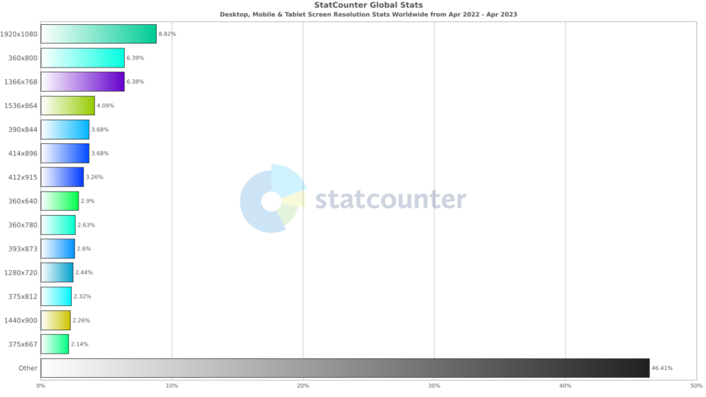
Screen resolution refers to the number of pixels displayed on a screen, typically represented as width x height (e.g., 1920 x 1080). Higher resolutions offer superior visual clarity and detail, but they also demand more processing power from devices. The most commonly used screen resolutions today include Full HD (1920 x 1080), 2K (2560 x 1440), and 4K Ultra HD (3840 x 2160). Considering these resolutions will enable you to optimise your responsive web design for a range of devices.
Standard device dimensions

Considering these popular resolutions will enable you to optimise your responsive web design for a range of devices. With this in mind, we advise focusing on the following breakpoints to cater for the majority of users:
- Design for desktops from 1280×720 to 1920×1080
- Design for tablets from 601×962 to 1280×800
- Design for mobiles from 360×640 to 414×896
Keep in-sync with industry standards and best practices for screen sizes from 360×640 through 1920×1080. While there is no definitive standard, understanding common screen resolutions and aspect ratios can serve as a helpful reference point. Your aim should be a website that is compatible with popular screen sizes to deliver an exceptional user experience.
Mobile-first design
With the surge in mobile device usage, adopting a mobile-first design strategy has become imperative. This approach involves designing websites primarily for mobile devices which focus on simplicity, touch-friendly elements, and streamlined content. Starting with a mobile-friendly design allows for a smooth scaling up to larger screens, ensuring a consistent experience across devices. By prioritising mobile users, you can cater to a significant portion of your audience and enhance their browsing experience.
Mobile content visibility
Ensuring optimal content visibility is a critical consideration when selecting a screen breakpoint. Designs that require excessive scrolling or zooming can frustrate users and lead to high bounce rates. To improve user engagement, keep important information above the fold, ensuring it is visible without the need for excessive vertical scrolling. Additionally, pay attention to typography, spacing, and layout to optimise readability and user experience across different screen sizes.
Cross-platform website testing
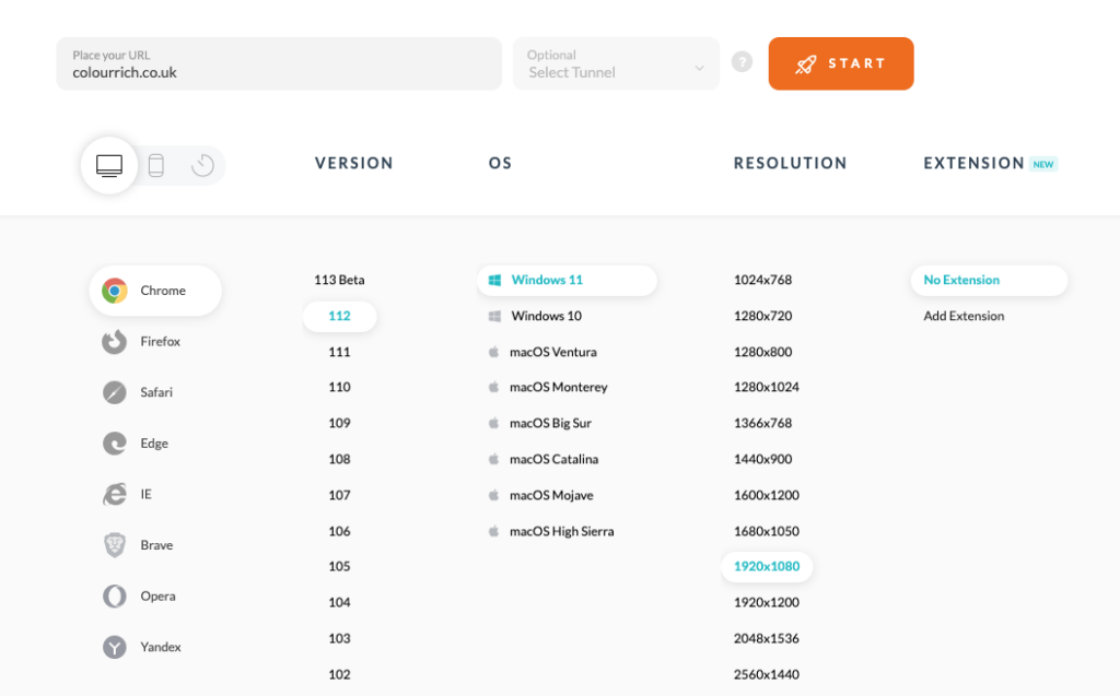
Thorough testing is essential to guarantee a seamless experience across various devices. Emulators and browser tools can really help to enable you to preview your websites on a range of devices.
Our favourite is LambdaTest. It’s great value for money and provides real-time testing on an huge number of platforms.

However, real-world testing on actual devices should also be conducted when possible. This helps to identify any potential issues and make necessary adjustments to ensure optimal performance. Testing allows you to uncover and address any design inconsistencies or usability concerns that may arise.
User demographics and analytics
Understanding your target audience is paramount when determining the ideal screen sizes for your web design. Analyse your user demographics and gather data on the devices they commonly use to access your website. This valuable information can be obtained within your Google Analytics account from Tech > Overview > Screen Resolutions, and will guide your decision-making process and help prioritise the screen sizes that are most relevant to your audience.

By tailoring your design to suit your users’ preferences and behaviours, you can create a more engaging and personalised browsing experience.
Will a responsive layout improve rankings?
Search engines, including Google, have adopted a mobile-first indexing approach. This means that the mobile version of your website is primarily considered for indexing and ranking purposes. If your site isn’t mobile-friendly, it may not perform as well in search results, leading to a potential decrease in visibility.
Migrating to a responsive mobile site can have a positive impact on your website’s rankings. Search engines prioritise mobile-friendly websites in their algorithms, considering factors such as mobile-first indexing, user experience signals, and reduced duplicate content. By optimising your site for mobile devices, you can enhance user experiences, increase traffic, and improve your chances of ranking higher in search results.
In conclusion
Selecting the right screen sizes for your new web design involves considering factors such as screen resolution, responsive and mobile-first design principles, content visibility, device testing, and user demographics. By embracing a user-centric approach and optimising the viewing experience for different screens, you can create websites that engage and delight users, regardless of the device they are using.


