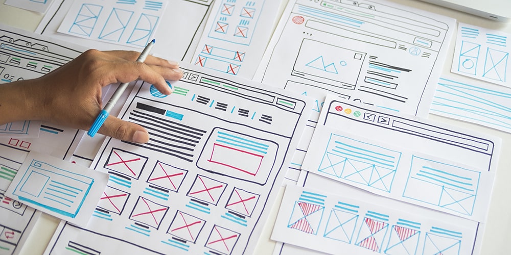
Web design has changed an awful lot over the years. Most people would assume that web design is as changeable as fashion design – a constant flux of styles and trends which are hot one second and not the next. But, one of the biggest overarching movements within web design has been the growing dominance of focusing on user feedback to guide design decisions.
It isn’t necessarily about what might look “cool” or what might be most graphically appealing. Instead, a lot of web design is now hyper optimised by tools which measure user interactions and feedback in the background, to a minute level. It’s this statistical information which is now more abundant than ever, and which drives a lot of web design decisions and choices.
This optimisation is all well and good, but many suspect there’s been an over-reliance on these sorts of scientific techniques. Those in this camp argue that the results have leaned toward a generic landscape of web design features, which might achieve a client’s goals at a statistical level but leave users feeling a bit cold.
We tend to agree with this point of view. We’re certainly not advocating an ignorance of modern web design practices and UX design, but here’s a look at a few trends that we think will be big in 2020, and which walk the line between functionality and originality really well.
eCommerce micro interactions
Micro-interactions have been around for years. The pioneers are probably in the social media space – think the Facebook thumbs up for liking posts, or the red Instagram heart for liking photos.
We expect to see micro-interactions become a bigger deal when it comes to brand design for eCommerce applications. Micro-interactions are an easy way to demonstrate the personality of a brand and to build trust, , when done in a smooth and sleek way.
Dark mode design
We’re fans of dark mode design. A few critics think that dark modes are a victory of science over art, but we’re in disagreement. Yes, it certainly is the case that dark modes add functional benefits like increased battery life and low-light settings. But they can look great from an aesthetic point of view too. Dark mode web designs look ultra modern, and remind us of super slick bezel-less smartphones. They make colour and design elements stand out without swamping the eye. An ideal marriage between style and substance.
More minimalism
For a while now minimalism has meant sheer white backgrounds and sumptuous images upfront, which show off products to their full potential. Apple are a great example of this.
As the web gets flooded with more noise, we expect to see a renaissance of this trend in the coming year. Simple templates are a sure fire way to land brand message and showcase products in a clear and concise way. It’s great from a user experience perspective as well.
But we don’t think this trend will just be consigned to imagery. We expect that frictionless experiences will create super easy interfaces for all sorts of things like payments, sign-ups and registrations – all the stuff that usually feels clunky an annoying.


